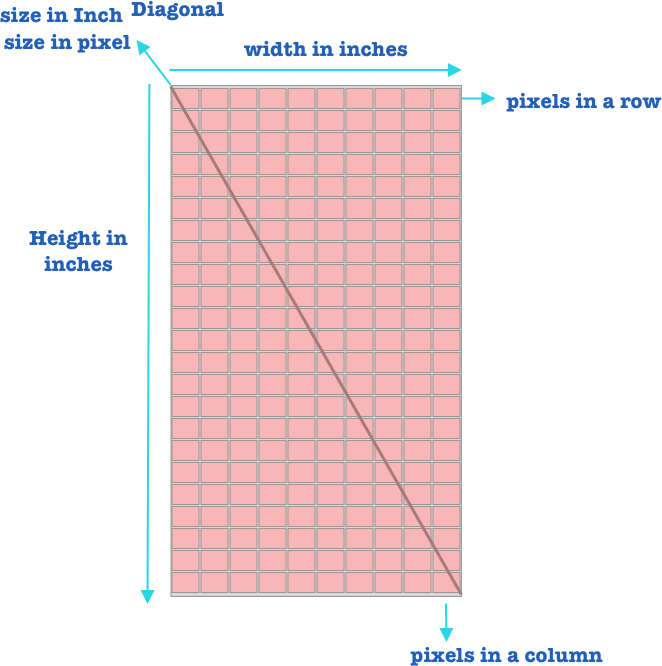
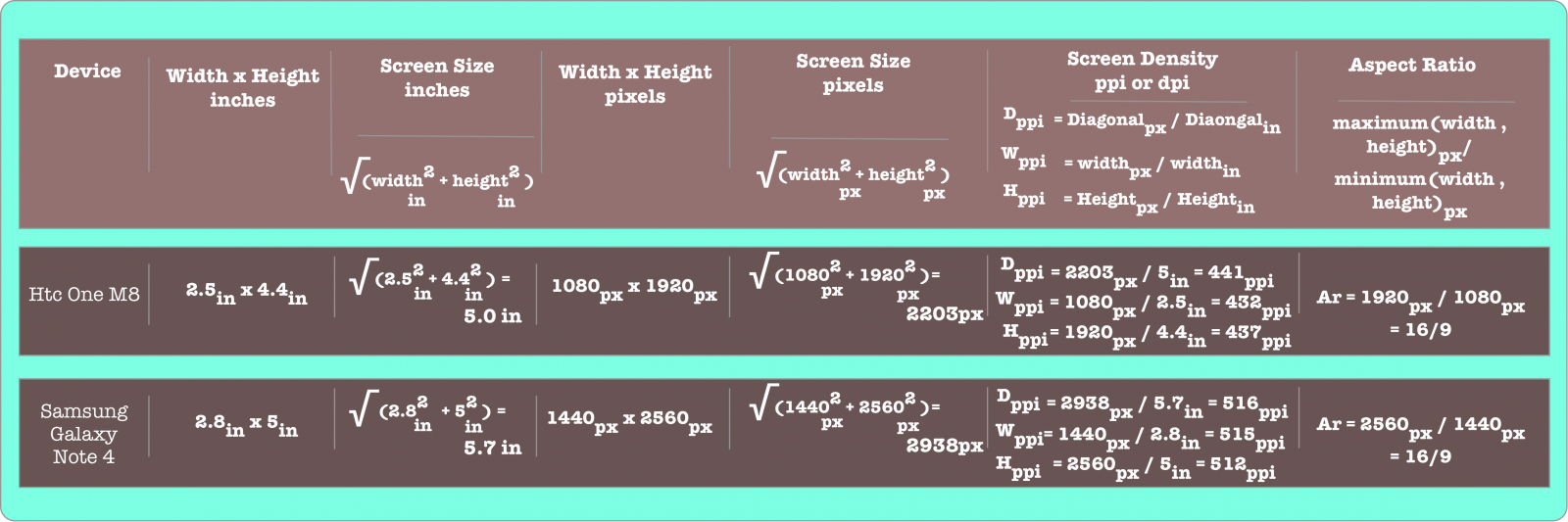
A smartphone , has a width and a height which can be expressed in inches . The screen size is the length of the diagonal of the smartphone , and which can be calculated using the pythagorean formula .
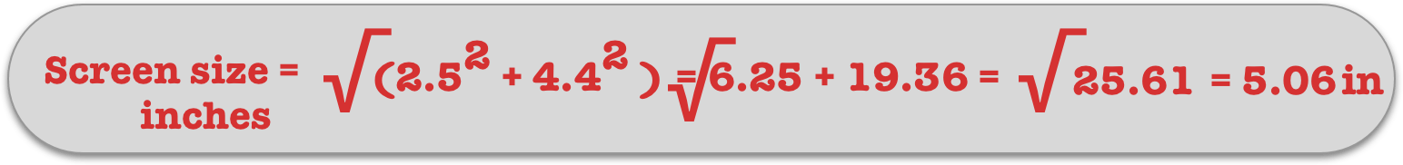
so for example if a smartphone has a width of 2.5 inches and a height of 4.4 inches , we can get the screen size in inches of this smartphone by using the pythagorean theorem .
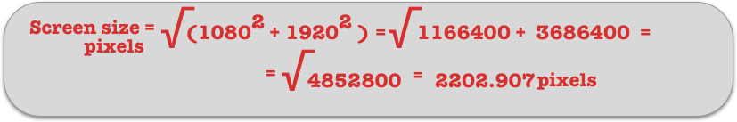
A screen has also a number of pixels in it . the pixel can be measured on the width and on the height of the screen . So for example , A smartphone which has a width of 2.5 inches and a height of 4.4 inches , can have on each row 1080 pixels and on each column 1920 pixels , as such it will have a width and height in pixels of 1080px by 1920px.
we can calculate the screen size in pixel by using the pythagorean theorem , so for this smartphone its screen size in pixels will be.
What is Screen density ?
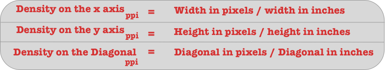
The screen density is the number of pixels per inch , we can calculate the density by using one of these three formulas :
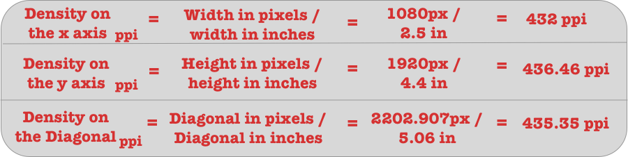
so for example a smartphone which has a width of 2.5 inches and of 1080px , and a height of 4.4 inches and of 1920px will have a density of :
Screen density is measured in ppi , pixel per inch , but sometimes we also use the notation dpi , which is dots per inch , this is the same thing .
What is Aspect Ratio ?
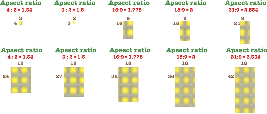
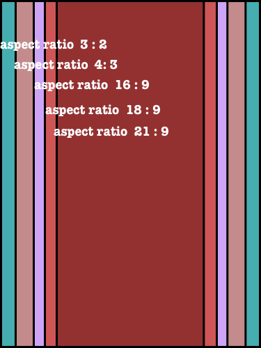
The aspect ratio is the ratio of the maximum of the (width , height) in pixels to the minimum of the (width , height) in pixels .
So for a phone which has a width of 1080px and a height of 1920px , it will have an aspect ratio of
So we can think of the aspect ratio as the rate of the width to the height or the height to the width depending on which one is larger. When the aspect ratio is 1 or closer to 1 , the screen or the image is a square . When the aspect ratio is larger and grows father away from 1 , the screen size or image , is rectangular .
So as we see in the previous picture when the aspect ratio is 4:3 , the screen or image will look more squared . When it is 3:2 , it is more , but not yet , rectangular . When it is larger than 3:2, it becomes more and more rectangular.
Also , as we see in the previous picture when the screens or images have the same width , a screen with a larger aspect ratio , has a bigger height , and it can contain a screen or image with smaller aspect ratio .
And when the screens or images , have the same height , a screen or an image with a smaller aspect ratio has a larger width than a screen or an image with a larger aspect ratio , as such it can contain it .
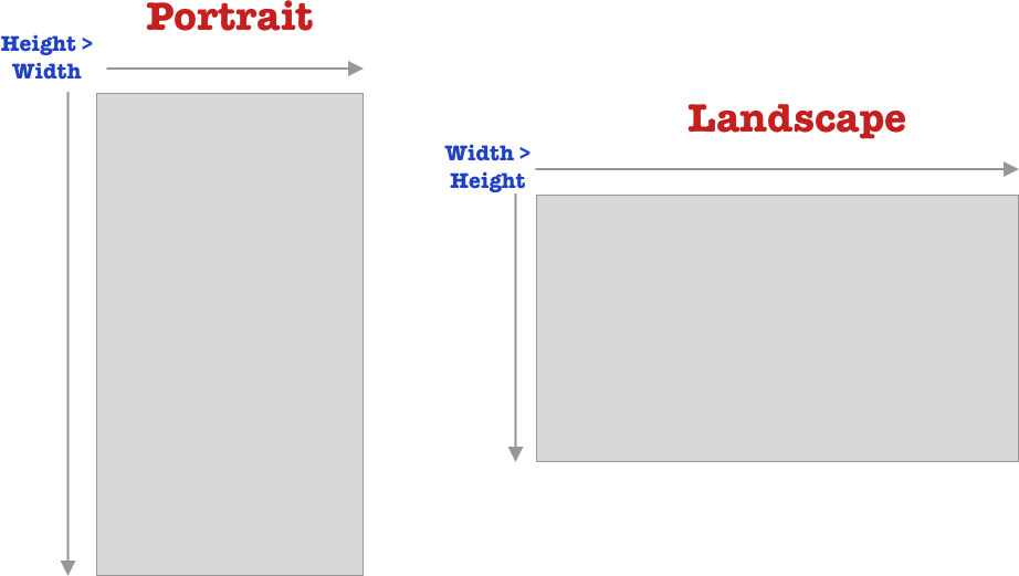
What is screen orientation ?
we have two screens orientation for a smartphone :
portrait
landscape
In portrait the height of the screen is larger than its width , and in landscape the width of the screen is larger than its height.
Screen measurement example
This is an example of various devices screen measurement
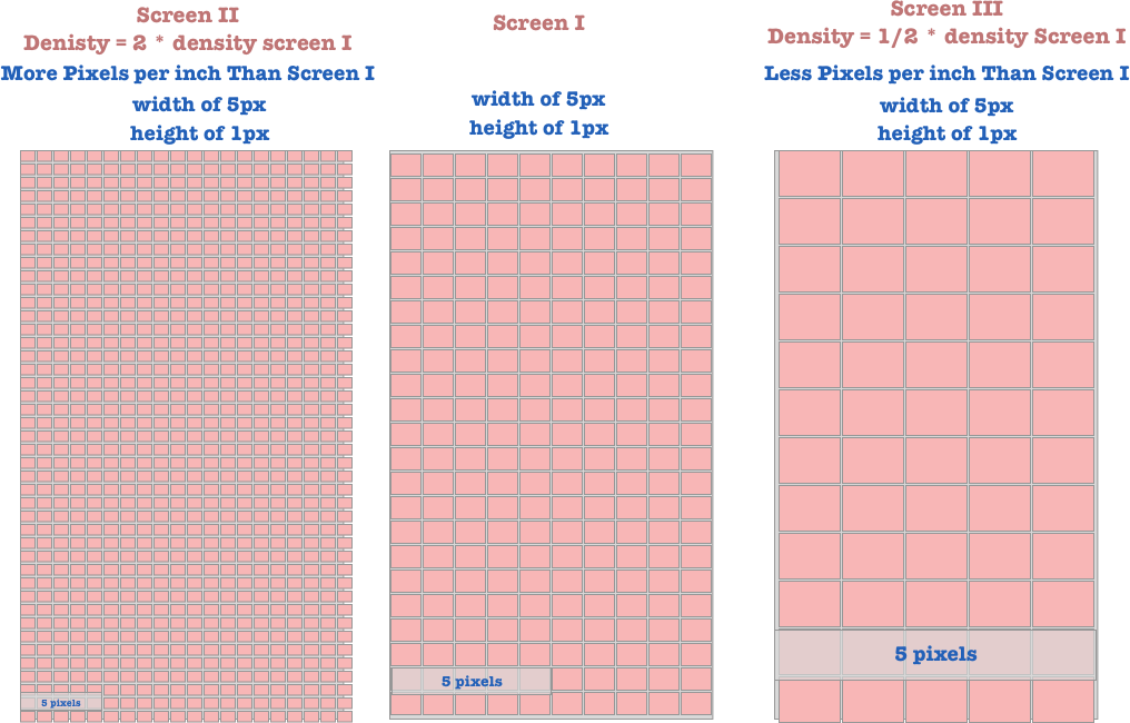
What does different screen densities mean ?
Smartphone screens can have different densities . This will affect how a drawable like an image or a shape will look on different screens . For screens with smaller densities , they will have less pixels per inch , as such the image will look larger . For screen with larger densities , they will have more pixel per inch , as such the image will look smaller .
What is DP (Density Pixel or Density Independent Pixel)
A density pixel is a way to measure which is dependent on the density of the screen , and indepent of the pixels . On various screen densities , 1 dp is equal to a various number of pixels , but on all screens 1dp is always equal to 1 dp .
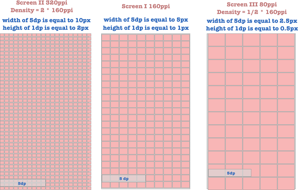
One pixel is defined to be equal to one dp , density (independent) pixel ,on a screen density of 160 ppi.
So this means that when the density of the screen is double the density of 160 ppi , the same dp will be double in pixels on the screen with double the density of 160 ppi.
This also mean that when the density of the screen is half the density of a screen that is 160 , the same dp will be half in pixels on the screen with half the density of 160 ppi.
To explain this more , when one screen is double in density of another one , this mean that the other one is half the density of the first . This can only happen in one of these three cases
The two screen have the same width in inches . As such one screen density is double the other , and the other is half the first , if and only if one screen has double the pixels of the other . So one screen will have double the pixels per in inch of the other one , and the other one will have half the pixel per inch of the first .
The two screens have different width , but they have the same number of pixel. The density of one is double the density of the other , and the density of the other is half the density of the first , if an only if the width of one is half the width of the other or the width of the other is double the width of one . So this mean that one screen will have double the pixels per inch of the other one , and the other will have half the pixel per inch of the first .
The two screens have different number of pixels and different width , so this is one of the two previous cases after doing simplification .
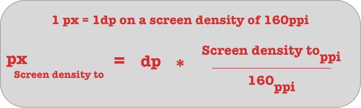
So to convert from dp to pixel , we can use the following formula
Which is simply if one pixel is equal to one dp on a screen density of 160 ppi , how much a dp will be equal to in pixels on a screen density of a given ppi ?
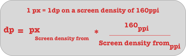
And to convert from pixels on a given screen density , to dp , we can just apply the formula.
so now this means that if we specify the width or height in dp , this width and height will look the same on all the screens , since on screens with different densities it will have different number of pixels as such it will look the same .
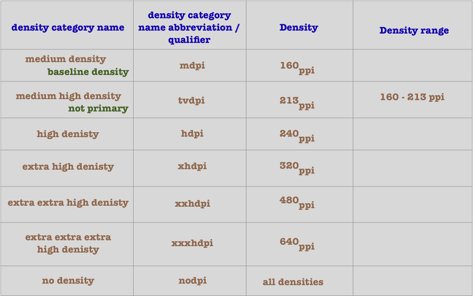
Screen density categories in android
Android group density ranges in categories , and for each category it gives a name , a qualifier , and a density which represent this category .
For example we have the medium high density , which has a qualifier of tvdpi . This is not a primary screen density category , and we shouldn’t use this category when designing for android. tvdpi has a range between 160ppi and 213 ppi , so android phones which have densities in this range will fall in this category , and they will be considered as having a density of 213 ppi . tvdpi density is used for tv .
The nodpi category represents all densities , so it doesn’t represent just one density category , and as such it can be used to target all densities .
For example , the Moto X (2nd Gen) has :
a width of 2.5 inches and of 1080 pixels
a height of 4.5 inches and of 1920 pixels
a diagonal in inches of ~5.2 inches
a diagonal in pixels of ~2203px
If we calculate its density using the formula :
size of the diagonal in pixel / the size of diagonal in inches
we will find that it has a density of 2203 / 5.2 ~ 424 ppi . This phone is considered to be in the extra extra high density category by its manufacturer , as such it is is in the xxhdpi category, which has a density of 480 dpi. This density is three times the medium density , mdpi , which is the baseline density .
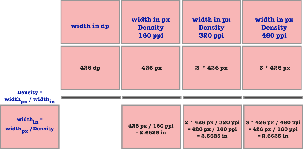
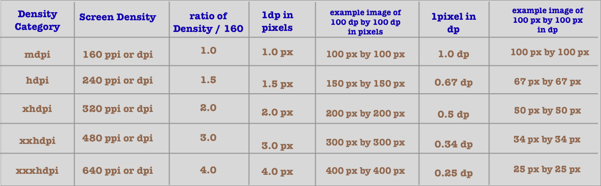
Conversion table for various screen categories
1 dp is considered to be 1 dp on all screen densities , but it has a different number of pixels on screen with different densities . As we have seen we can calculate how much a dp is in pixel by using the formula
Pixel = DP * Density / 160
This is a table which list the various ratio of various screen categories , and how to convert from 1dp to 1 px and from 1px to 1 dp .
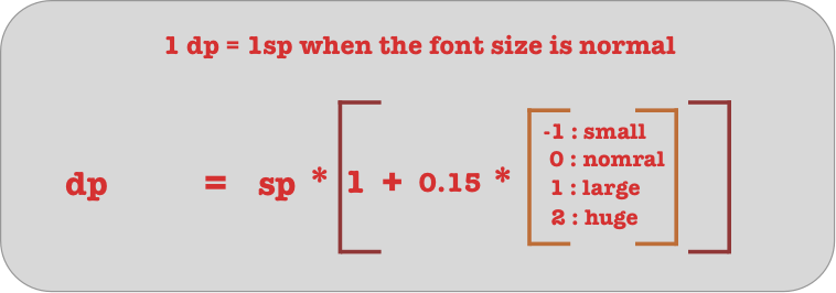
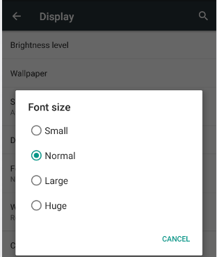
What is SP (Scale Pixel or Scale Independent Pixel)
SP stands for scale pixel , or it can also mean scale independent pixel . SP is like DP , so for different screen densities 1 sp will have a different number of pixels. SP is also affected by the user set font size , which can be small , normal , large or huge .
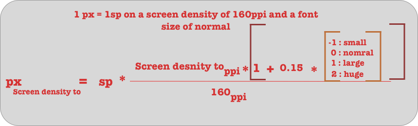
The formula for converting from sp to pixel is the following :
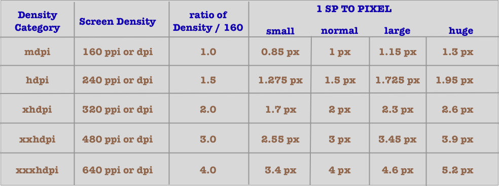
This is a table , that convert from sp to pixels for various screen densities , and when the font size is small , normal , large and huge .
To convert from SP to DP , the formula is the following
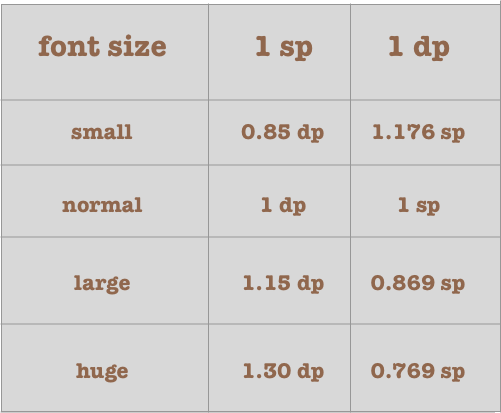
This is a table to convert from sp to dp and from dp to sp , when the font size is small , normal , large and huge .
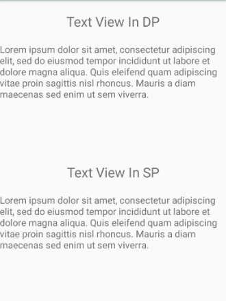
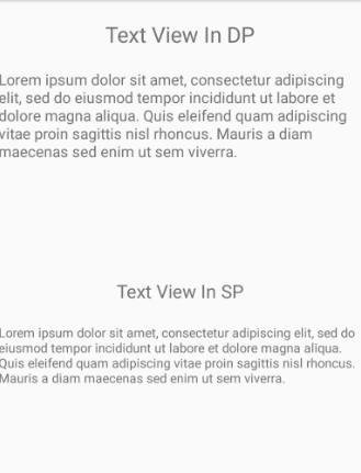
An example of text measured in sp and dp , for various font size
In this example , we have some text views where the size of the text is specified both in sp and in dp . The size is equal to 23 [dp|sp] for the title , and 16 [dp|sp] for the paragraph . When the font size is normal or default, they will look the same .
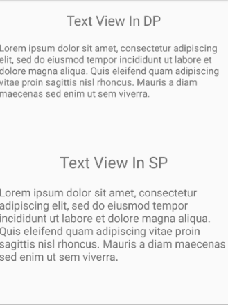
when the user change the font size and set it to large or huge , the font size in SP will look larger .
And when the user change the font and set it to small , the font size in sp will look smaller.
So when setting the font size in dp , it will not scale when the user change the font size , it will remain the same . When setting the font size in sp , it will scalle when the user change font size .
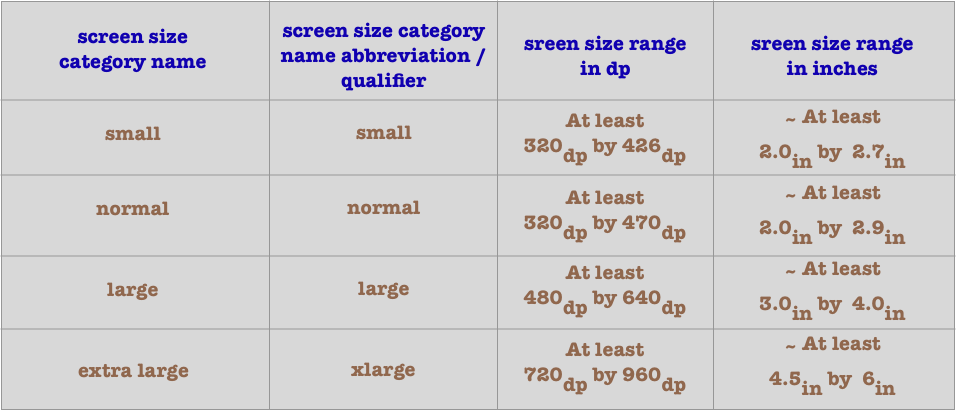
Screen size categories in android
Android group screen sizes’ range in categories , and for each category it gives a name and a qualifier .
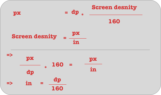
The formula for calculating the screen size in inches from the screen size in dp is the following .
or we can use this formula .
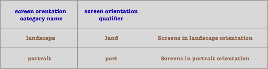
Screen Orientation categories in android
There are two orientations for a screen , they are landscape and portrait . Android provide qualifiers for both of these orientation .
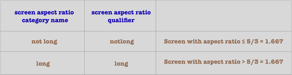
Screen Aspect ratio categories in android
Aspect ratio is the ratio of the largest side to the smallest one . There are two aspect ratio categories in android , they are long and not long . Android provides qualifier for both of these categories .
What is the use of the screen categories or qualifiers ?
When designing for various smartphone in android , we can provide resource for each smartphone using the screen categories .
Screen density categories
We can use the screen density categories when designing for various densities . As such we can provide various resources like drawables for various densities categories . If a phone density falls within this category , the drawable or resource that is provided is used , if it doesn’t android will scale the resource or drawable from the closest density category that is available .
When scaling an image up , this will add pixels to it , so this will make it blurry , when scaling image down , this will remove pixels from it , so this can also make it blurry , and will consume memory . If ressources or drawable are placed in a nodpi resource folder they will not be scaled up or down , but they will be used as is , for all screen densities .
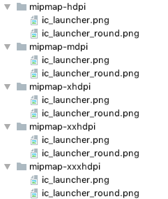
To use a qualifier , we just append to the folder name the qualifier name . In this example we have provided an icon for our application for various screen densities.
By default , if we don’t specify in which category density a resource is , it is added to the baseline category , which is mdpi .
Screen size categories
Screen size categories are used when designing for various screen sizes .Usually we want to provide a different layout when the screen size is a larger or smaller . This is done by adding the size qualifier to the resource folder name .
No autosizing is performed for various screen size categories . The resources are only used starting the screen size qualifier that is provided .
The default screen size category used by android is the normal screen size . So when we are creating ressources and layouts , without specifying the screen size , they are the resources for normal screen sizes . Normal screen sizes , are screens which are at least 320 dp by 470 dp or 2.0 inch by 2.9 inch .
if we provide resources for larger screen size , they will not be scaled down , and as such the application will crash when run on smaller screen size .
Screen orientation categories
Usually we want to provide various layout when the orientation of the smartphone change . We can use the port and land qualifier to design for various screen orientations , and provide various resources based on various orientations . This can be done by adding the land or port to the resource folder name .
layout-port
layout-land
By default when designing , we are designing for portrait mode , and this design will be used when the phone is in landscape mode .
Screen aspect ratio categories
There are two aspect ratio categories that we can design and provide resources for in android , they are the long and notlong. long is for screen with aspect ratio larger than 1.677 , and notlong is for screens with aspect ratio less or equal 1.667 . we can append the aspect ratio qualifier to the name of the resource folder to target each aspect ratio .
Related Posts:
Solving english ruler problem using recursion in… We must print an english ruler using recursion . An english ruler is ruler where each unit has a number of tick. a unit can be divided into smaller units at 1/2 the interval 1/4 the interval 1/8 the interval…
The DisplayMetrics class in android a tutorial What is the DisplayMetrics class ? The DisplayMetrics class is used to get various information about the screen in android .The information that we can get are the following : DENSITY_DEVICE_STABLE : The density of the device in ppi read…


 So as we see in the previous picture when the aspect ratio is 4:3 , the screen or image will look more squared . When it is 3:2 , it is more , but not yet , rectangular . When it is larger than 3:2, it becomes more and more rectangular.

